
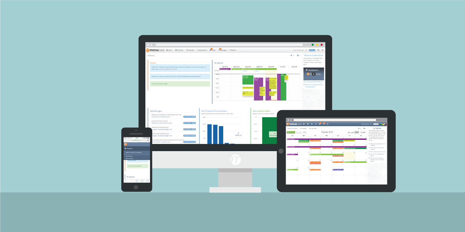
Here at Merus we love and accept screens of all shapes and sizes! Big, small, we love you all! Because of the wide variety of screens, we have made some exciting adjustments (otherwise known as responsive design) to version 4.0 of MerusCase in order to make sure all pages of the application are highly flexible and adaptable, no matter what kind of screen you’re viewing MerusCase on.
If you are a current user of 4.0, or have been keeping up with our sneak peeks and previews you may have noticed that there have been several navigation and display changes. Many of these were put into place to make this one-page-fits-all idea work as well as optimize MerusCase for mobile use. A few examples of these changes can be seen in the new drop-down menus, the billing entries screen, and the introduction of right panel view. Now, if you view a case on your mobile device, it will look the same as if it were opened on a desktop! The drop-down menu bars make navigation easier on mobile devices and billing entries have been simplified for mobile use as well. This means no more endless scrolling, zooming in, zooming out, or missing parts of your page. You will also notice that if you make the window on your desktop bigger or smaller, the page will simply adjust accordingly. Pretty cool, right?
Desktop computer, iPhone or Android, iPad, or notebook, try out MerusCase on any screen you have and let us know how it goes!


Leave a Reply